Website Redesign – VoiceAttack
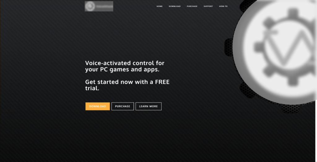
Original
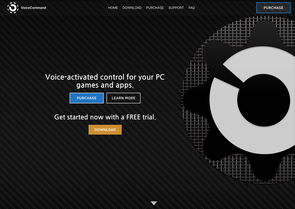
Redesign
Goals & Constraints
- To fix the readability of the website. Immediately when viewing the website the menu was hard to read, it was not immediately clear how to purchase the product
- To make the available CTAs more visible.
- To keep the colour palette as close as possible to the original as I believe it suits the niche tech solution product that is being offered. ‘Dark mode’ is currently very popular among internet users and gamers in particular to which this product is advertised.
The menu
Problem: The menu was small, hard to read and blended into the background of the website.
Solution: I made it clearer by enlarging the font and placing it in the center of the page. While putting a slight blur behind the menu made it stand out from the background.
Another small change made was re-wording the ‘How-To’ page to ‘FAQ’ which better represents the information found on that page.
CTA’s
Problem: The option to Purchase the software was not immediately obvious.
Solution: The shift of the menu position, company name and logo, opened up space in the top right corner for a new CTA to purchase the product.
Adding a secondary Purchase button in the menu combined with separating the purchase and trial options and increasing the font size in the center of the screen makes the important information stand out and gives more prominence to the purchase of the product.
In alignment with my goal, I kept the Orange colour for the Download button, meaning a different colour was needed for the Purchase button. I chose Blue to contrast against the black, white and orange of the rest of the website and improving the visibility of the purchase option.
Flow
Problem: It was not obvious that this was not a static single screen homepage but in-fact you could scroll down to reach each section of the website.
Solution: My first thought was to show part of the next section at the bottom of the page however I felt this would take away from the impact of the top of the page. Instead I chose to use an arrow to subtly indicate there is more information below and to encourage the user to scroll down.